Oralmedik OMK
BRANDING / WEB DESIGN / UX RESEARCH
––––––––––––––––
A medical center for a small city in southern Chile.
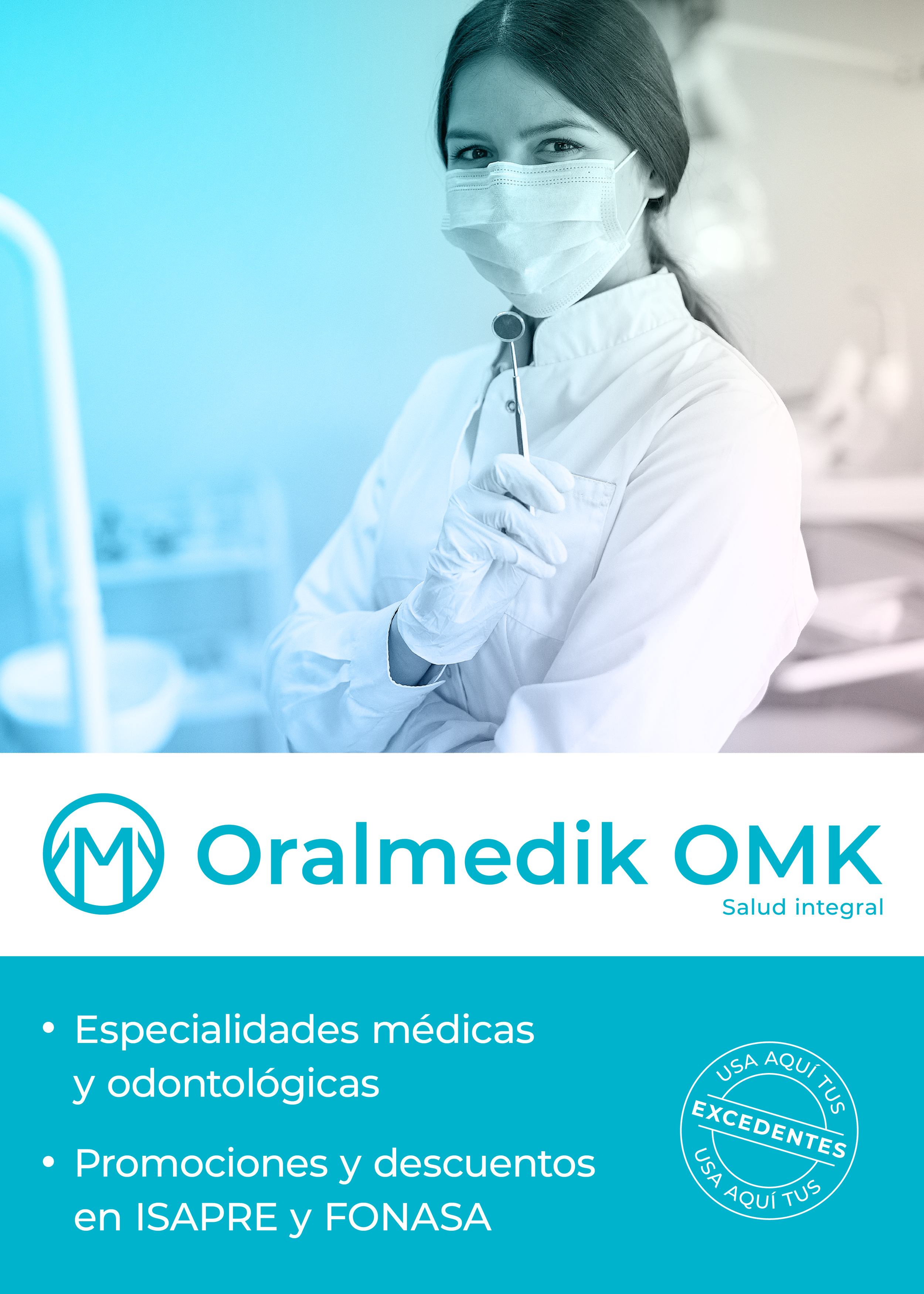
Oralmedik is a medical and dental center created by two dentists and a commercial engineer from Temuco, the capital of Chile’s Araucanía Region. Located in Pitrufquén, 30 kilometers south of Temuco, Oralmedik provides local access to essential services that previously required residents to travel to the regional capital. With fair pricing and broad accessibility, Oralmedik meets a critical need in the community.
Project realized as a freelance designer.

Logotype
This project began with the development of a brand identity under the name Oralmedik. We started by researching the local identity of Pitrufquén, where one of the town’s key landmarks is the railway bridge located at its entrance. Inspired by this symbol, the final logotype was crafted to incorporate the initials “O” and “M” from the brand name. The tagline “Salud Integral” (Integral Health) was added to highlight the center’s commitment to a wide range of medical specialties.
Shortly after the brand’s launch, a renaming was required due to legal considerations. The name was modified to Oralmedik OMK, incorporating the familiar abbreviation used by both the team and clients. This adaptation also created the opportunity to use “OMK” as a simplified version of the brand name.

© Mauro Entre Durmientes, 2012.


Color Palette
The brand’s color palette includes shades of blue, turquoise, and green, complemented by abundant white. This choice aims to convey a sense of healthcare accessibility, fitting the medical center’s location in a strip center alongside supermarkets and stores. To enhance visibility, Oralmedik primarily uses bright colors, allowing it to stand out and be easily recognizable from a distance.
Web design
Oralmedik’s web design was commissioned with inspiration from UnoSalud’s website, a well-known dental center with branches throughout Chile. The goal was to replicate similar functionality and detail. An analysis of UnoSalud’s website was conducted to ensure it served as a strong example in terms of usability.

In terms of architecture, the UnoSalud website was overly complex. It contained dead ends, basic mistakes, and an excess of links, which cluttered the site and made navigation less intuitive.

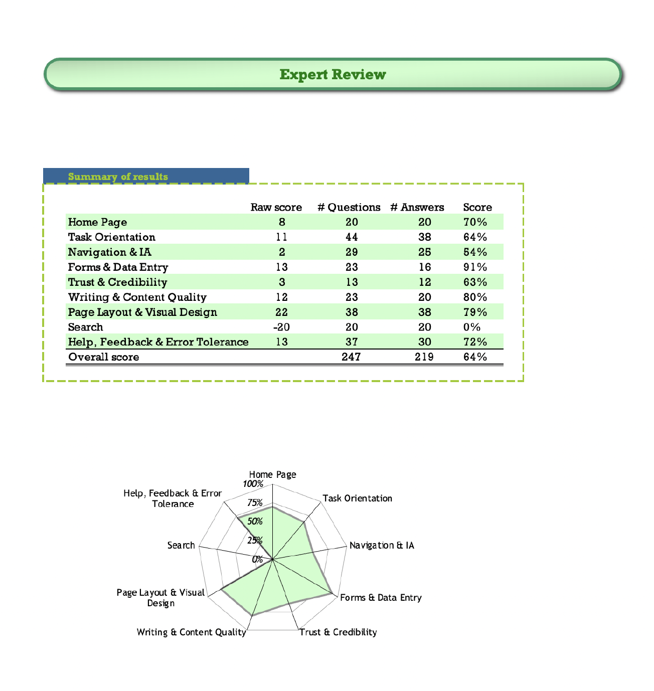
Usability guidelines from Usability Expert Review by David Travis at UserFocus were applied. This guide assesses a website’s usability based on 247 parameters grouped into nine categories, each providing a percentage score. The overall score for the evaluation was 64%, indicating that in certain areas, the UnoSalud website was not an ideal model. Using these insights as a foundation, the architecture proposal for the Oralmedik OMK website was developed, drawing inspiration from UnoSalud but with a more streamlined and optimized approach.

Proposed improvements
HOME
Simplify the home page to avoid the information overload and excessive scrolling found on UnoSalud’s site. The goal is to create a concise introduction, with elements organized hierarchically and minimal need for scrolling.
Integrate an archive for the home page and news.
Improve the proportion of elements to clearly distinguish promotional content from essential site information.
TASK ORIENTATION
Reduce non-essential information that distracts from primary interactions.
Arrange menu and home page elements in a clear hierarchy to enhance key interactions.
Minimize the number of screens users must navigate to complete tasks.
Include pricing information whenever possible.
Ensure smooth site navigation, allowing users to explore seamlessly.
Enable form-saving in case a user leaves the site.
Eliminate broken links.
NAVIGATION AND INFORMATION ARCHITECTURE
Remove unnecessary intermediate levels.
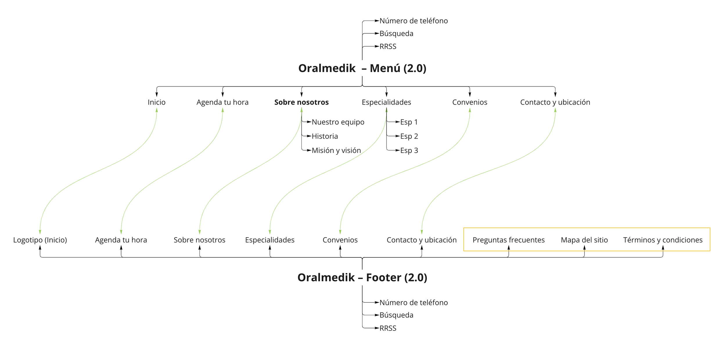
Add a site map accessible from the footer.
Differentiate hyperlinks and buttons based on their function (e.g., navigating within the site, opening new windows, or sending emails).
FORMS
Include default values as examples in each form.
Streamline information requests, asking only for essential data to avoid user overload.
TRUST AND CREDIBILITY
Add patient testimonials or quotes. Photos are optional but would enhance credibility.
Include professional credentials (carried over from the previous site).
Feature bios of key team members and founders.
WRITING AND CONTENT QUALITY
Avoid generic “see more” buttons; instead, use custom buttons or hyperlinks specific to each situation.
Favor lists and infographics over large text blocks.
Keep text brief and use clear, accessible language, avoiding technical jargon.
PAGE LAYOUT AND VISUAL DESIGN
Ensure that images leading to content are accompanied by descriptive text to prevent confusion.
SEARCH
Add a search bar on the home page’s main view and in the footer.
HELP, FEEDBACK AND ERROR TOLERANCE
Include a Frequently Asked Questions section.
When users make errors, politely suggest corrections and/or guide them on next steps.
Add a contact form with minimal required fields.
For mobile users, provide an easily accessible button for direct calls.
Content hierarchy
Based on a survey of 24 potential Oralmedik OMK users, the following content hierarchy was developed:
Schedule a dental or medical appointment
Medical and dental specialties
Information about the team of professionals
Contact information
Years of experience or certifications
Promotions and discounts
Location
Information about the facilities
Agreements and payment options
News and updates
Wireframes / Prototype
The initial wireframes were created in Figma and evolved into the main website prototype. The design features a central button that links to the appointment request form—an essential interaction for users—while also being accessible through the menu. However, on the contacts page, this button directs users to the phone number instead. Menu items are organized based on survey results and Oralmedik OMK’s goals. The prototype primarily contains placeholder text, which will be replaced with client-provided content.
Final result


The final version of the website is complete and ready for publication. A final testing phase will be conducted to identify any elements that may need adjustments based on user and client feedback. Once published, the link will be added to this project.
