
Naming
The naming process starts with collaborative sessions with the nōn team to generate an extensive list of potential names. This involves researching sources related to the brand’s activities—such as articles, newspapers, and scientific papers—and brainstorming all possible name ideas. Since the company focuses on cultivating microalgae for use in cosmetics, the name should reflect this focus, either subtly or overtly. From this long list, the strongest options are selected to create a shortlist of 5 to 10 names, which are then presented to the client for final selection.
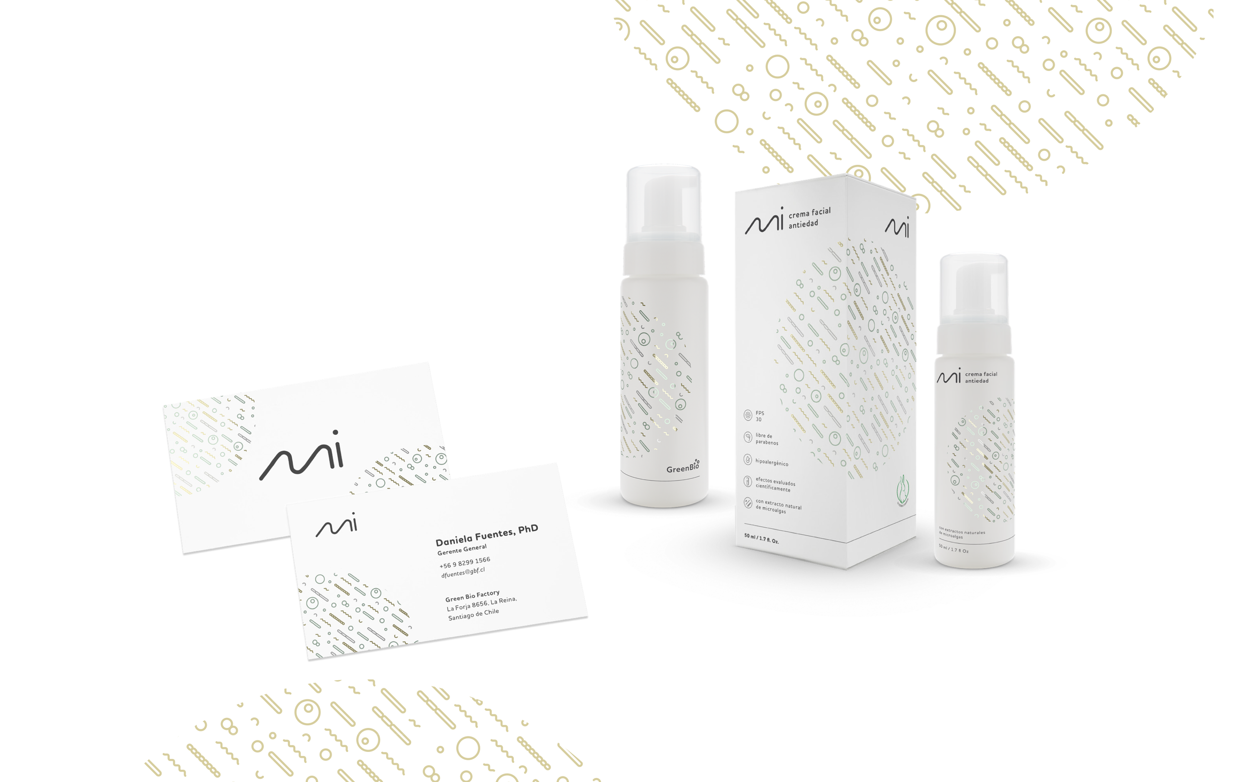
Initial Logo Concepts
The first logo concepts centered on the name “Mi,” stylized as “mi.” These initial designs aimed for a minimalist, scientific, and gentle look to align with the brand’s cosmetics and skincare focus. The tagline “crema” (Spanish for “cream”) was used in the logo to suggest a product, with the flexibility to swap it out for other product names as needed.

Initial logotype
In the chosen logotype, we added the slogan “natural science” in italics to represent the entire brand. On product packaging or in specific references, this slogan is replaced with the product name.

First proposed brand
The initial brand design featured abundant white space with green and gold metallic foils. Text color was a dark gray, avoiding the use of rich black. The typeface selected was Houschka Rounded by Nick Cooke from G-Type.
Iteration / Final logo and brand
While attempting to register the name, we discovered that Chilean law prohibits registering “Mi,” as it is a possessive determiner in Spanish (“my”) and considered too generic. This required us to revisit the shortlist and select a new name. In a meeting with stakeholders, we chose “micrae,” which conveyed a similar meaning without registration issues. This choice proved successful, and the name was easily registered.
Additionally, the stakeholders decided to reduce production costs, prompting adjustments to the brand identity. We developed new complementary graphics using seaweed imagery and adopted a more cost-effective color scheme that didn’t require metallic foils or stamping.

Packaging
The primary packaging consists of 50 ml pump bottles with lids, packaged in flat cardboard boxes. The boxes are directly printed, while the bottles feature transparent adhesive labels with the design printed on them. We also organized a photoshoot with a hand model, showcasing the product in a setting and with materials that reflected the brand identity.


